Any experienced marketer will tell you that effective packaging is the secret to success in the world of soft drinks. But when it comes to soda packing "effective" means more than a durable container with the brand name on it. It means thinking and rethinking the psychological aspects of the packaging from the material you use (glass bottles, aluminum cans) to the typography used for the brand name and everything in between. In this post, the team at Rocky Mountain natural soda takes a close look at the psychology behind soda packing and how it works.
How Soda Packing Influences Customers' Buying Decisions
Some people will go so far as to buy a specific brand of soft drink for years even if they're not crazy about the taste, just because they want to be seen holding it, consuming it, enjoying it. If you understand that then you're on your way to gaining a rudimentary understanding of soft drink marketing.
The following are the key aspects of soft drink packing marketers manipulate in order to lure in a specific demographic.
"In the store, the packaging acts as a gateway to the product. Consumers look at the packaging and respond to how it makes them feel at that moment. If the consumer feels that the product can potentially satisfy their needs, it influences their buying behavior."
—Medium
The Logo
When it comes to the average consumer some purchases are strictly practical while others - mostly those tied to discretionary spending - are emotional in nature. The logo is one of the prime drivers of those emotions. People react in subtle emotional ways to seeing certain logos because they conjure up images and associations that dovetail with the person's vision of themselves and the world as they would like it to be. This type of relationship with brand logos is what creates repeat customers.
What the Research Says:
- Logos evoke emotional connections that drive brand loyalty — A research study by Aaker (1997) highlights how brand personality, expressed through logos, fosters emotional connections that influence consumer preferences and repeat purchases.
- Brand logos create implicit associations with consumer self-identity — A study by Journal of Brand Management (2013) found that consumers subconsciously align their personal identities with brand logos that reflect their values and aspirations.
- Visual familiarity with logos reduces decision-making time. According to a study by Reber et al. (2004), familiar logos trigger cognitive fluency, making them easier to process and leading to quicker consumer choices.
Typography
If you want your soda pop packaging to speak to your target demographic you have to choose the typography carefully. Mastering typography can take years, so we're not going to be able to explain all its vagaries here. But it's crucial that the font you choose aligns with your brand message and is something that will click with the people you hope to reach. Typography must also make your product stand out from the competition at the same time it conveys your brand values and effectively carries that brand message we just talked about.
Watch the following video for a closer look at the psychological aspects of typography.
What the Research Says:
- Font style influences perceived brand personality — Doyle & Bottomley (2004) found that serif fonts are associated with sophistication and tradition, while sans-serif fonts evoke modernity and simplicity.
- Unique typography improves brand recall — According to Henderson et al. (2004), distinctive fonts increase consumer recognition and memory of a brand, leading to stronger brand association —
- Typefaces impact perceived quality of a product — A study by McCarthy and Mothersbaugh (2002) showed that elegant fonts give the impression of premium quality, while casual fonts create a more approachable brand identity —

Layout
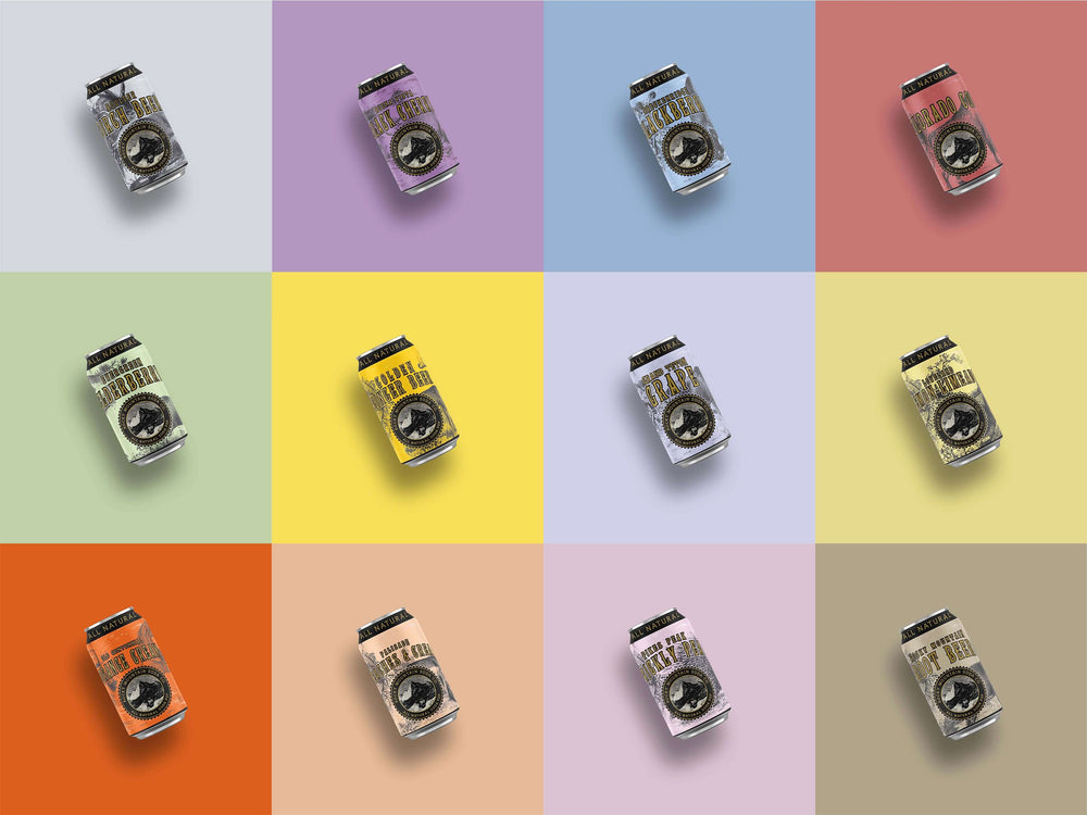
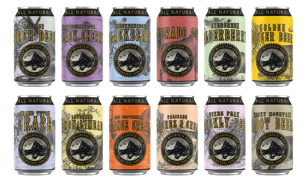
You would not expect the layout on an energy drink can to be the same as a can of our natural sodas. They are targeting two entirely different demographics and attempting to create an entirely different set of associations with their use of typography, color and more. How they arrange the information on their bottles and cans will be different as well.
Often on bottles and cans of big-brand beverages, the only thing that's readily visible are the big, bulbous, and brightly-colored letters that comprise the name. Ingredients and other more mundane information are de-emphasized because the target demographic tends to care less about them than they do about the active, lively image conjured by the way the name is presented.
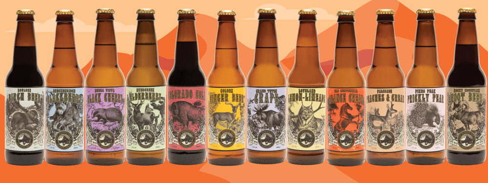
A bottle of Rocky Mountain Sarsaparilla, by contrast, will present a more balanced, aesthetically pleasing layout with a logo font that conjures associations with the Old West, a wink-wink nod to the Sasquatch myth associated with the Northwest and then plenty of room given to information deemed important to the target demographic in the form of banners that proudly declare: "All Natural", "Small Batch" and "Made With Cane Sugar". In both cases, proper attention paid to demographic priorities result in effective layouts.
What the Research Says:
- Layout impacts visual attention and consumer choice — According to Pieters and Wedel (2004), consumers are naturally drawn to prominent brand names and images, while fine details like ingredients often receive less attention.
- Minimalistic layouts can convey premium quality — A study by Orth and Malkewitz (2008) found that clean, uncluttered designs are associated with high-end products, while busy, high-contrast layouts are linked to energetic and youthful brands.
- Layout influences brand trust and perceived transparency — According to van Rompay and Pruyn (2011), packaging designs that make information easy to find and read increase consumer trust and perceived authenticity.
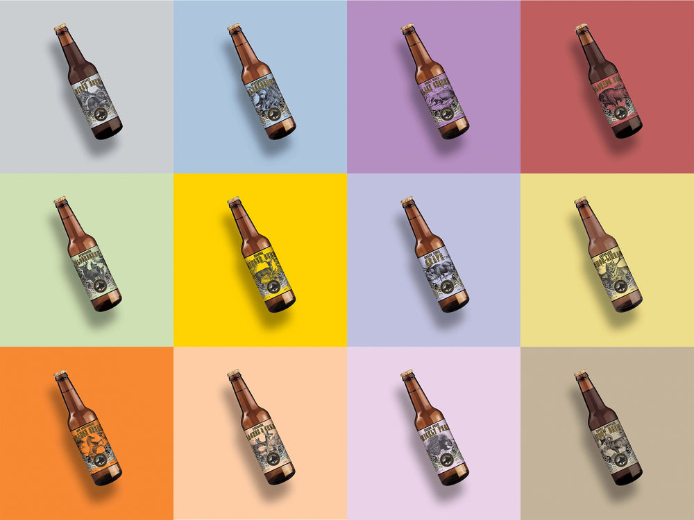
Brand Colors
Color is another powerful tool marketers use to drive consumer choice. For example, when it comes to soda what do you think of when you think of the color red? If you're like 90% of people you think "Coca Cola". That is neither an endorsement of Coke nor a condemnation. It's just the way it is. And it's the result of effective and consistent marketing. Red is the color of youth and passion and excitement. If you want your brand to be successful you need to pick a color that embodies qualities that speak to your demographic.
What the Research Says:
- Colors influence brand perception and consumer behavior — Research by Labrecque and Milne (2012) found that color can communicate brand traits such as excitement (red), competence (blue), and sincerity (green) —
- Color–brand associations become ingrained through repeated exposure — A study by Bottomley & Doyle (2006) showed that certain colors, like red for Coca-Cola, are deeply associated with brands due to decades of consistent marketing.
- Warm colors increase impulse purchases, while cool colors evoke trust — Research by Gorn et al. (1997) found that warm colors (red, orange, yellow) create urgency, making them effective for food and beverage brands, whereas cool colors (blue, green) are linked to trust and reliability.

Packaging Material

Everyone these days is familiar with aluminum cans and are willing to accept just about anything that comes in them. But is running with the pack good enough for you? Glass, for instance, is seen by most consumers as a type of premium packaging, one that sends a message that your pop has something special going on. Given that glass is 100% recyclable and will break down on its own over time it is also more eco-friendly than aluminum or plastic (you'll never hear about a Great Pacific Glass Patch). And that can be an important factor when trying to lure in environmentally conscious consumers.
What the Research Says:
- Glass packaging is perceived as premium and sustainable — A study by Steenis et al. (2017) found that consumers associate glass bottles with higher-quality products and are more likely to perceive them as environmentally friendly.
- Consumers prefer sustainable packaging when given a choice — According to Magnier and Schoormans (2015), eco-friendly materials like glass and biodegradable plastics positively influence purchase intent and brand perception.
- Material choice affects taste perception — Research by Carvalho et al. (2017) showed that beverages served in glass bottles are perceived as tasting better compared to those in plastic or aluminum.
Mistakes That Can Lead to Unsuccessful Packaging
The above constitute some of the most important aspects involved in the psychology behind soda packing and how it works. If you hit all the right beats with your packaging you will give your nascent brand a fighting chance in an already crowded soft drink space.
That said, packaging mistakes often have their root in other oversights and misjudgments, such as:
Failing to accurately define your target demographic
If you do not pay enough attention to defining your target demographic you will not be able to formulate effective packing for your pop. As a result, you are likely to have so-so results at best. As someone once said, "Wars are won or lost before a single shot is fired." The same is true for marketing. If you do not do the necessary upfront work to define your target audience, that lack of preparation will be an anchor that drags down all your subsequent marketing efforts.
Disregarding what your research is telling you
If you want to market your soda pop to environmentally conscious consumers you'd best come up with a way to attract their attention with your labeling. If you decide that doing so is too much of a hassle and that your target demographic will simply buy whatever you put on the shelf you'll be in for a rude awakening. The best marketers make handsome salaries because they understand the importance of sweating every detail.
Avoiding these pitfalls is crucial if your packaging efforts are to pay off.
The Bottom Line
The psychology behind soda pop packing is real and must be respected if your soda brand is to have a fighting chance to elbow its way into the minds of consumers.
The discreet deployment of the above-listed marketing truths by Rocky Mountain natural soda is a prime example of how to put those principles to productive use. By respecting established psychological marketing truths we have been able, in just a short time, to establish ourselves as the premier vegan, gluten-free, kosher soft drink brand, while making things like no GMOs unlikely assets.